Featuring:
I had never had a proper logo for my website before, so I set out to design one! I started by making a list of the functions that my logo needed to achieve and design elements that it needed to have. Here’s a short list of the things that I came up with:
• Incorporate my name and the name of my website
• Be legible at various sizes and as a watermark on picture and video content
• Minimalistic in order to go with the rest of my website design
• Square or rectangular in shape to compliment the shapes of buttons and other website design elements
• The colours match or compliment the colours of the website
• Adaptable to future colour and overall design changes
• Contain the copyright year information (if possible)
• Reflect my personality (if possible)
My previous design skills were limited to Paint, Kid Pix, Spooky Kooky Monster Maker, and about three weeks of playing with an old version of Photoshop as part of a highshool web-design class.
Nevertheless, I soldiered on. I downloaded a trial version of Adobe Illustrator and did what everyone else does these days when they have no idea what they are doing: I Googled and watched Youtube videos.
I started with the idea of having my logo within a very simple orange box. I thought that it would look neat to have the ‘m’s in ‘Kim’ and ‘Cums’ to intersect, but that didn’t turn out the way I wanted it to so I quickly abandoned the idea.
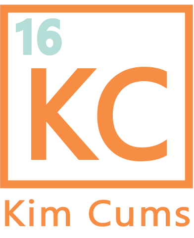
After that, I decided to simplify things even more and changed ‘Kim Cums’ to ‘KC’. Now I just had ‘KC’ written in orange in my orange logo box. This looked fine, it was legible, simple, and scaled nicely, but it felt flat and a bit too simple.
However, I realised what my logo was beginning to look like…an element on the periodic table!
All it was really missing to complete that idea was its ‘atomic number’! So I quickly added the ‘16’ to the corner to the upper left hand corner of my logo. The ‘16’ represents 2016, and therefore provides both a copyright and archive reference for anyone who watches or finds any of my content.
It also adds a bit more personality to my logo. I have always loved science and having my logo mimic being an element from the periodic table gives it that slightly nerdy edge that I wanted.
It’s always nice to hear that you design is a success too, so I was extremely thrilled this week when someone told me: “I love the little watermark on your pictures too! It makes me think it’s almost like a new element on the periodic table!”
xoxo Kim
